Let’s build some graphs with Powershell and PSGraph.
I love to visualize things. There are just some patterns that are hard to see in tables of data that can jump out to you when it is visualized. Today, I am going to be working with my new module PSGraph.
#Index
What is PSGraph
It is a set of helper functions that makes it easy to generate the DOT files used by the GraphViz engine for making graphs. They handle the language specification so you can just make great graphs.
A quick graph before we start
Take a look at this example.
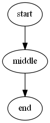
graph basic {
    edge -From start -To middle
    edge -From middle -To end
}
We define that we are creating a graph. We draw edges between the nodes start,middle and end in that order.
Installing PSGraph
I publish this module to the Powershell Gallery to make it easy to get started. There is only one other dependency and that is GraphViz. Here is how I get started.
# Install GraphViz from the Chocolatey repo
Find-Package graphviz | Install-Package -ForceBootstrap

# Install PSGraph from the Powershell Gallery
Find-Module PSGraph | Install-Module

# Import Module
Import-Module PSGraph
Introducing new commands
I created a few new commands to make these graphs easy to generate. Here are the basics to start with.
A graph defines a new graph for us. A node is an individual object on the graph. An edge is a connection between two nodes on the graph. Then Export-PSGraph turns our graph into an image.

graph g @{rankdir='LR'} {
    node a @{label='Node'}
    node b  @{label='Node'}
    edge -from a -to b @{label='Edge'}
} | Export-PSGraph -ShowGraph
All three command allow you to specify a [hashtable] to set various properties. I tell the graph to render left to right. I also give the nodes and the edge a label. Using a label for a node a allows you to use a shortname as a reference but still display a more verbose name in the final graph
Example: Project flow
Let me map out something real so you have a better idea of what these commands can do. This is my project workflow.
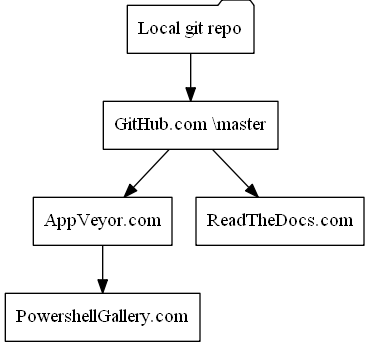
graph g {
    node -default @{shape='rectangle'}
    node git @{label="Local git repo";shape='folder'}
    node github @{label="GitHub.com \\master"}

    edge git,github,AppVeyor.com,PowershellGallery.com
    edge github -to ReadTheDocs.com
} | Export-PSGraph -ShowGraph
In this graph I set the default node shape to rectangle. The next thing I do is define 2 new nodes. I give both of them a new label so I can use a short name in my graph definition. Then I create all the edges to all the nodes. If an edge discovers a new node, it will get created automatically with the default attributes.
I also gave the first edge command a list of nodes. Those nodes are linked in order from first to last.
Example: A more detailed project flow
Here is a second example where I add a few more nodes and use more attributes.
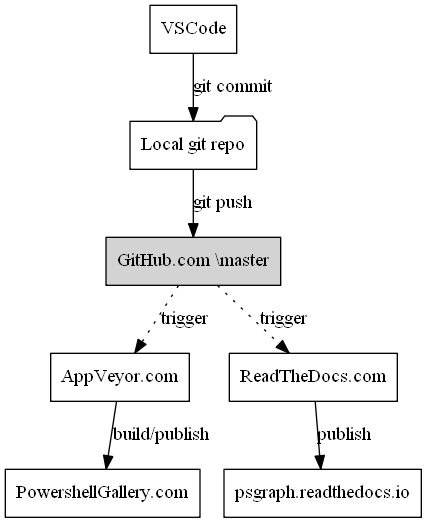
graph g {
    node -default @{shape='rectangle'}
    node git @{label="Local git repo";shape='folder'}
    node github @{label="GitHub.com \\master";style='filled'}

    edge VSCode -to git @{label='git commit'}
    edge git -To github @{label='git push'}
    edge github -To AppVeyor.com,ReadTheDocs.com  @{label='trigger';style='dotted'}
    edge AppVeyor.com -to PowershellGallery.com @{label='build/publish'}
    edge ReadTheDocs.com -to psgraph.readthedocs.io @{label='publish'}
} | Export-PSGraph -ShowGraph
You have full access to all edge, node and graph attributes that the DOT language specification allows.
Scripted graphs
It’s one thing to handcraft a graph. If that is all you are doing, you may find it easier to use the native DOT language. The real fun starts when we are scripting the graphs. That was the whole reason I wrote this module.
Example: Server farm
Imagine you wanted to diagram a server farm dynamically. I am going to auto generate some server names dynamically, but these could be pulled from your environment.
# Server counts
$WebServerCount = 2
$APIServerCount = 2
$DatabaseServerCount = 2

# Server lists
$WebServer = 1..$WebServerCount | % {"Web_$_"}
$APIServer = 1..$APIServerCount | % {"API_$_"}
$DatabaseServer = 1..$DatabaseServerCount | % {"DB_$_"}
With that list of names, we can now quickly produce a graph like this.
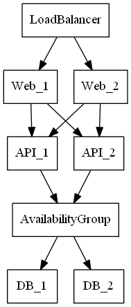
graph servers {
    node -Default @{shape='box'}
    edge LoadBalancer -To $WebServer
    edge $WebServer -To $APIServer
    edge $APIServer -To AvailabilityGroup
    edge AvailabilityGroup -To $DatabaseServer
} | Export-PSGraph -ShowGraph
I really like how clean that looks. If you play with the number of servers at each level, the graph will adjust to the changes. Because I can provide arrays for each part of the edge command, I can describe the relationship at a higher level. The edge command works out the logic between the individual nodes automatically.
Example: Structured data
Drawing edges between lists is a great start but we often have data that is structured. Importing an employee CSV and mapping the org chart is a classic use case.
For this example, we are going to walk a folder. Because the body of the graph is just a script block, we can use in line Powershell to create more complicated graphs.
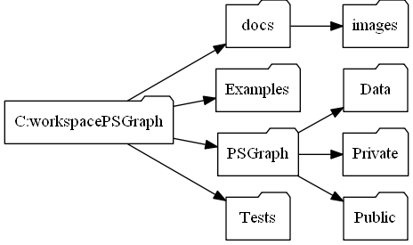
$folders = Get-ChildItem C:\workspace\PSGraph -Directory -Recurse

graph g @{rankdir='LR'}  {
    node -Default @{shape='folder'}
    $folders | ForEach-Object{ node $_.FullName @{label=$_.Name} }
    $folders | ForEach-Object{ edge (Split-Path $_.FullName) -To $_.FullName }
} | Export-PSGraph -ShowGraph
I first enumerate each node to give it a label. I want to see a short name in the graph, but I want to use the FullName as the ID of the node. This way I can have 2 folders with the same name and not mess up the graph.
What’s next?
I have a full set of documentation and examples posted at psgraph.ReadTheDocs.io and the source is also posted https://github.com/KevinMarquette/PSGraph. I walk each command in more detail and talk about other commands that I did not cover here. There is a lot of depth to these command but this is more than enough to get you started making cool stuff.